Client: Campina
Year: 2024
Agency: Chuck Studios
Project: Culinary Strategy & Photography Production
My Role:
Research, ideation, testing, strategy, visual development, art direction
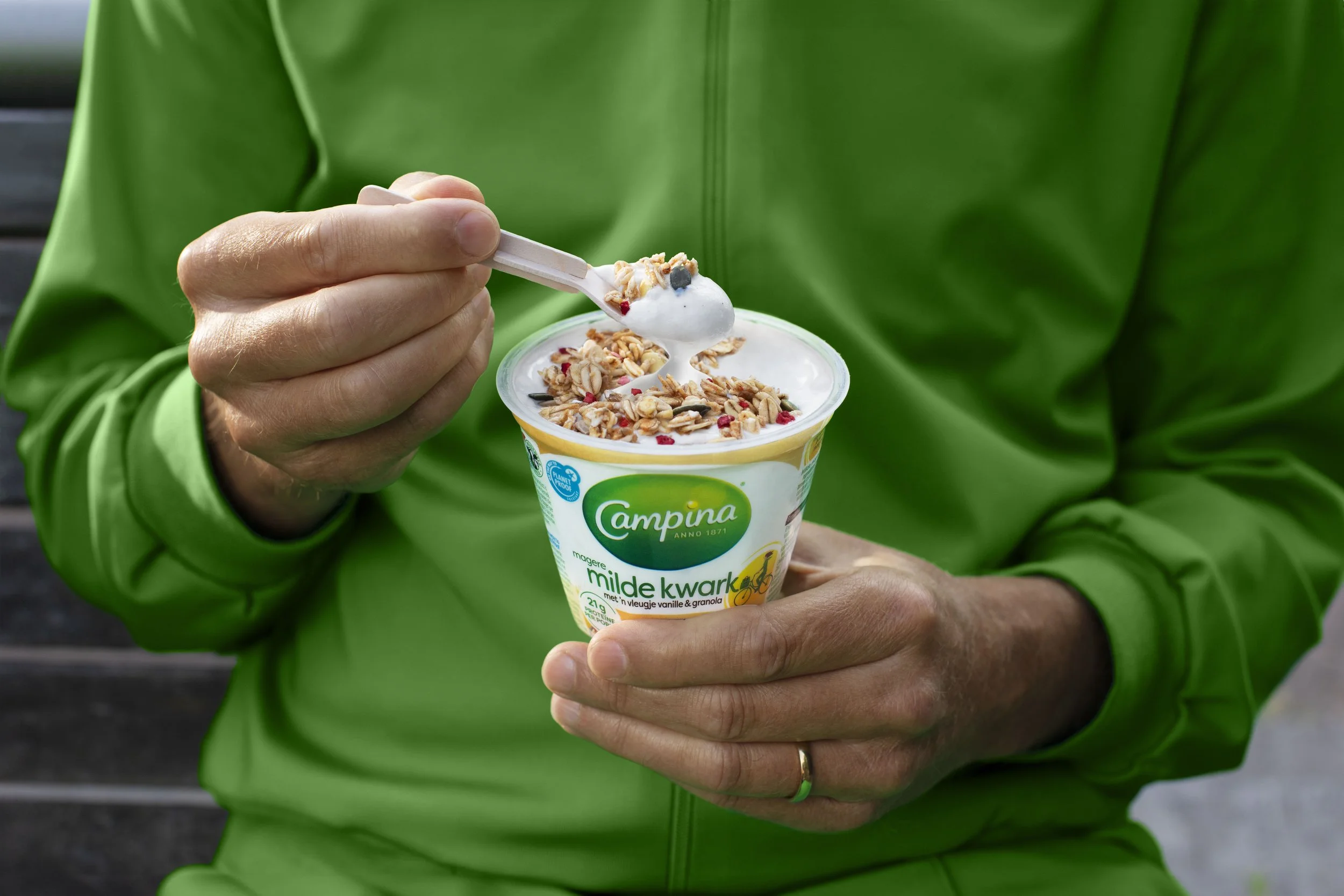
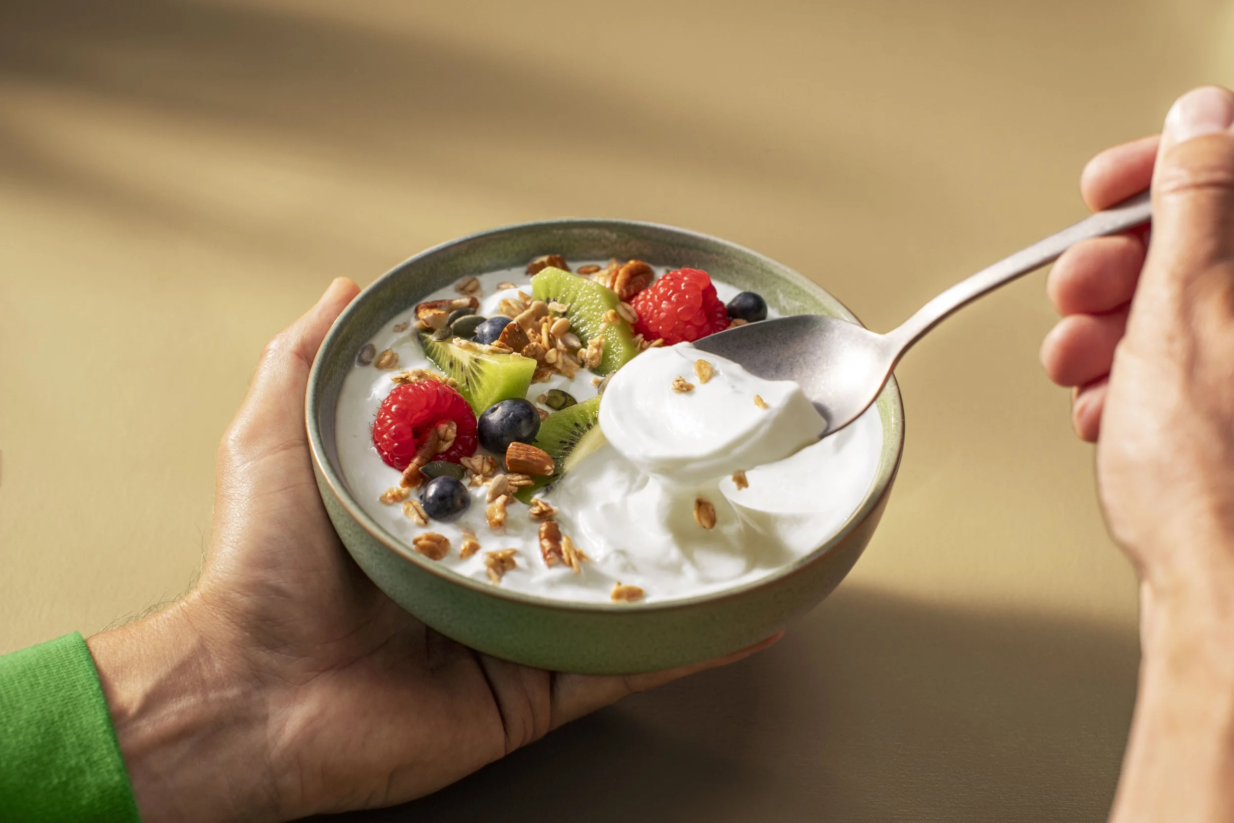
The project aimed to refine Campina's "Voor een betere morgen" visual identity by creating distinct, taste-driven food visuals and clear guidelines that consistently translate the brand's values across all assets and touch points.
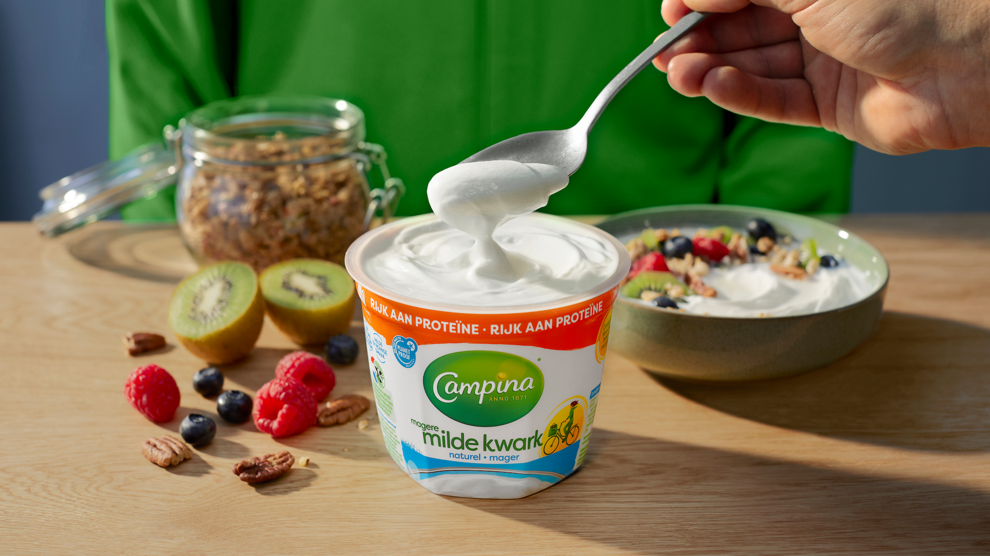
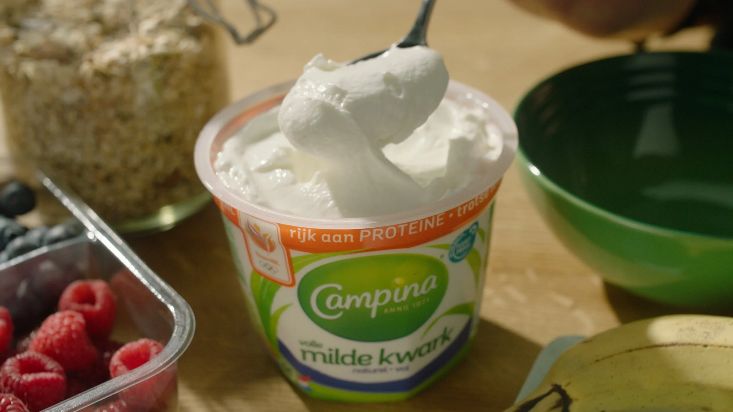
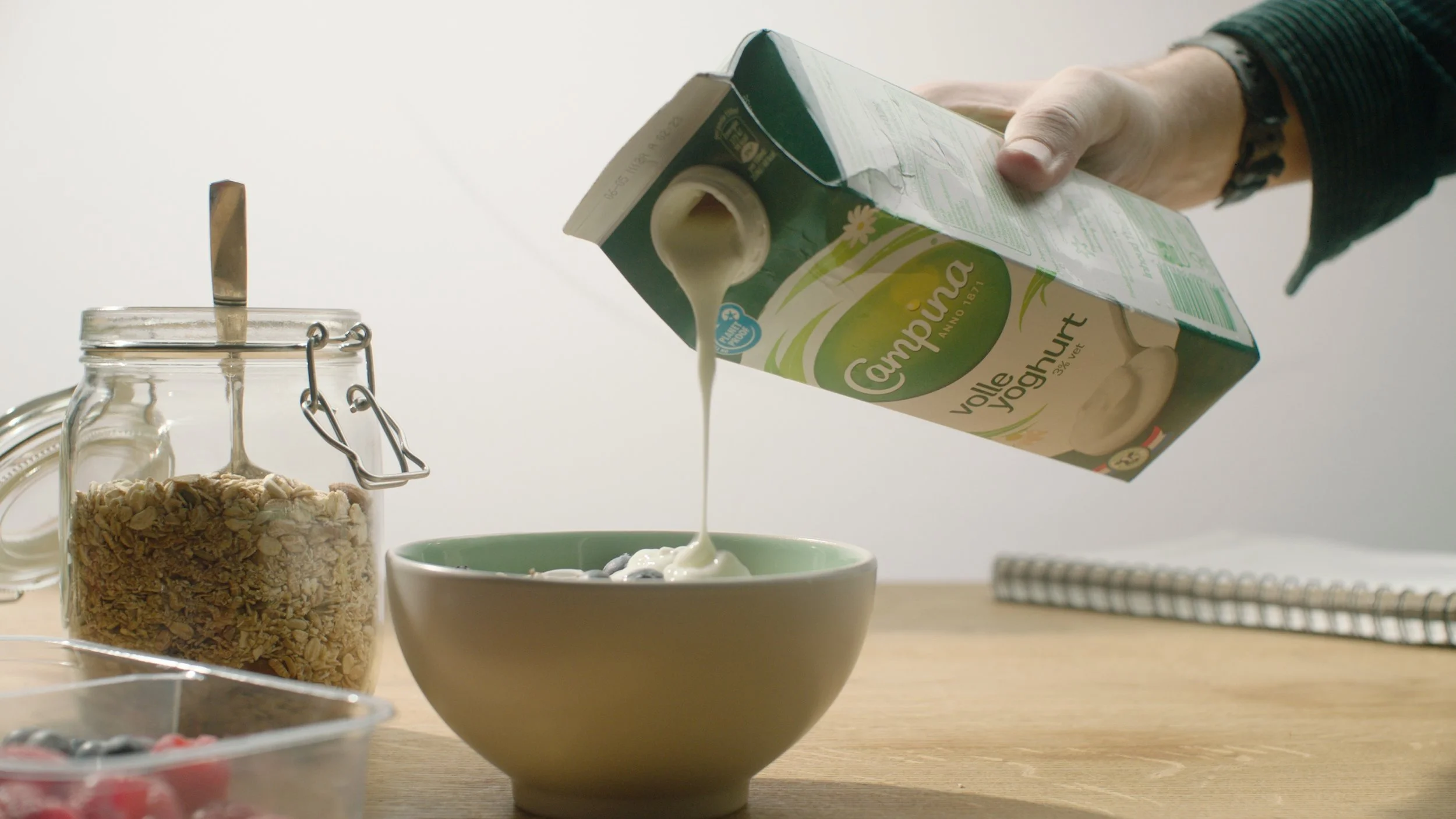
We brought Campina’s “Voor een betere morgen” platform to life by creating a distinctive visual style that made its food truly speak the brand. Absorbing Campina’s values and studying its products, we explored possibilities using our brains, hands, and cameras to craft a consistent and appetising representation of their quark range. By developing a culinary foundation that captured the brand’s essence, we provided guidelines to ensure every shot, from TV commercials to key visuals, communicated Campina’s promise of a better tomorrow with maximum taste appeal and clarity.
Execution & Collaboration
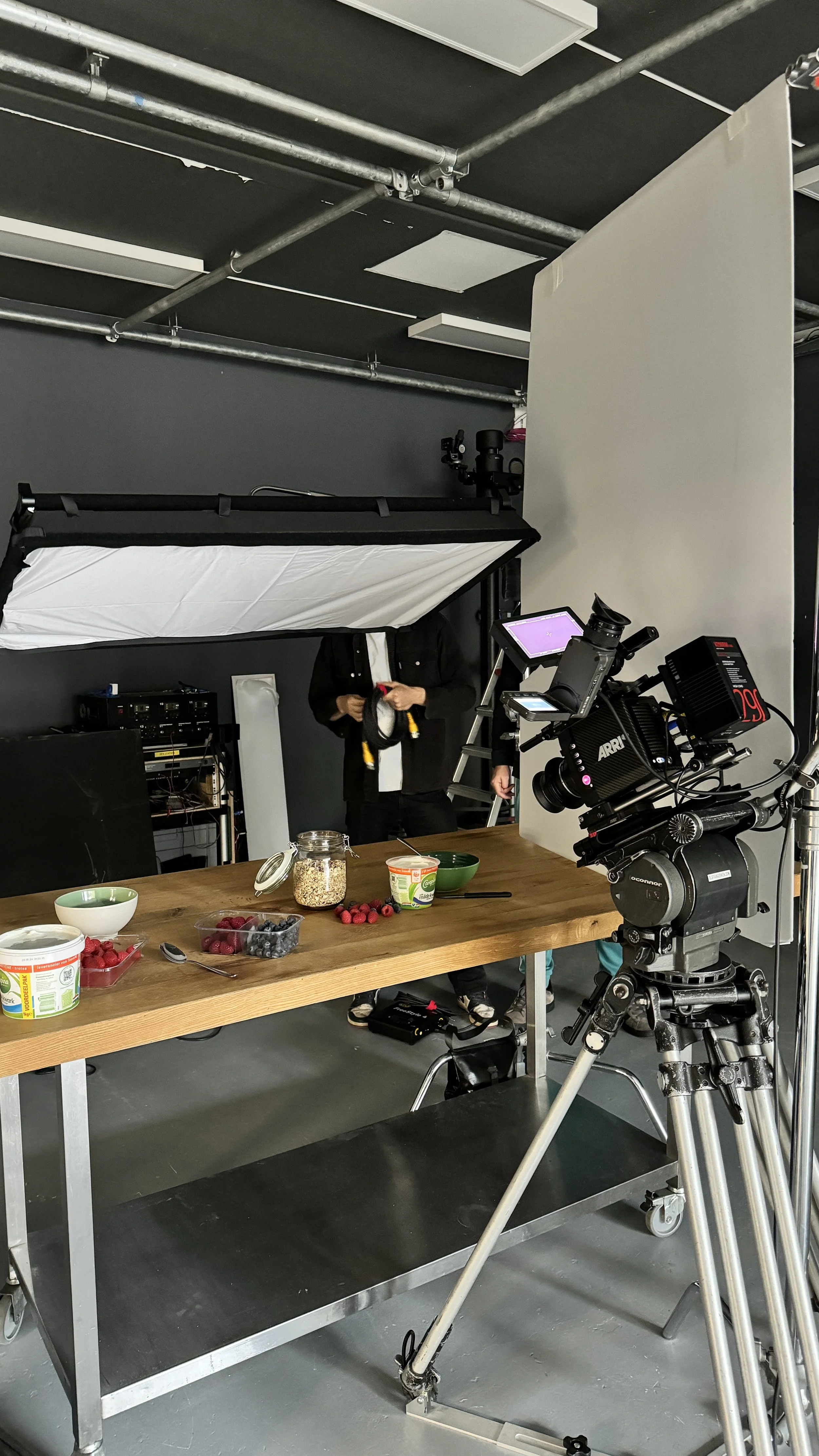
As part of the Chuck Studios team, I played a central role in executing Campina’s culinary identity. This involved collaborating with external partners, including agencies Design Bridge and Fitzroy, to develop a cohesive visual identity that translated Campina’s brand values into food depictions.
I worked closely with creative teams across Chuck Studios and external agencies, aligning on brand values and ensuring consistency across all assets. My role involved contributing to the ideation and development of distinct food depictions that became central to the campaign’s visual identity.
By identifying key challenges in taste appeal, product hierarchy, and alignment with brand values, I helped refine concepts through multiple iterations.
Managing feedback from various stakeholders, I ensured that our creative direction remained cohesive while balancing input from partners and Campina’s internal team.
Despite tight timelines, I contributed to delivering innovative, impactful visuals that upheld the brand promise. This required careful planning, adaptability, and a focus on balancing creativity with feasibility.
outcome
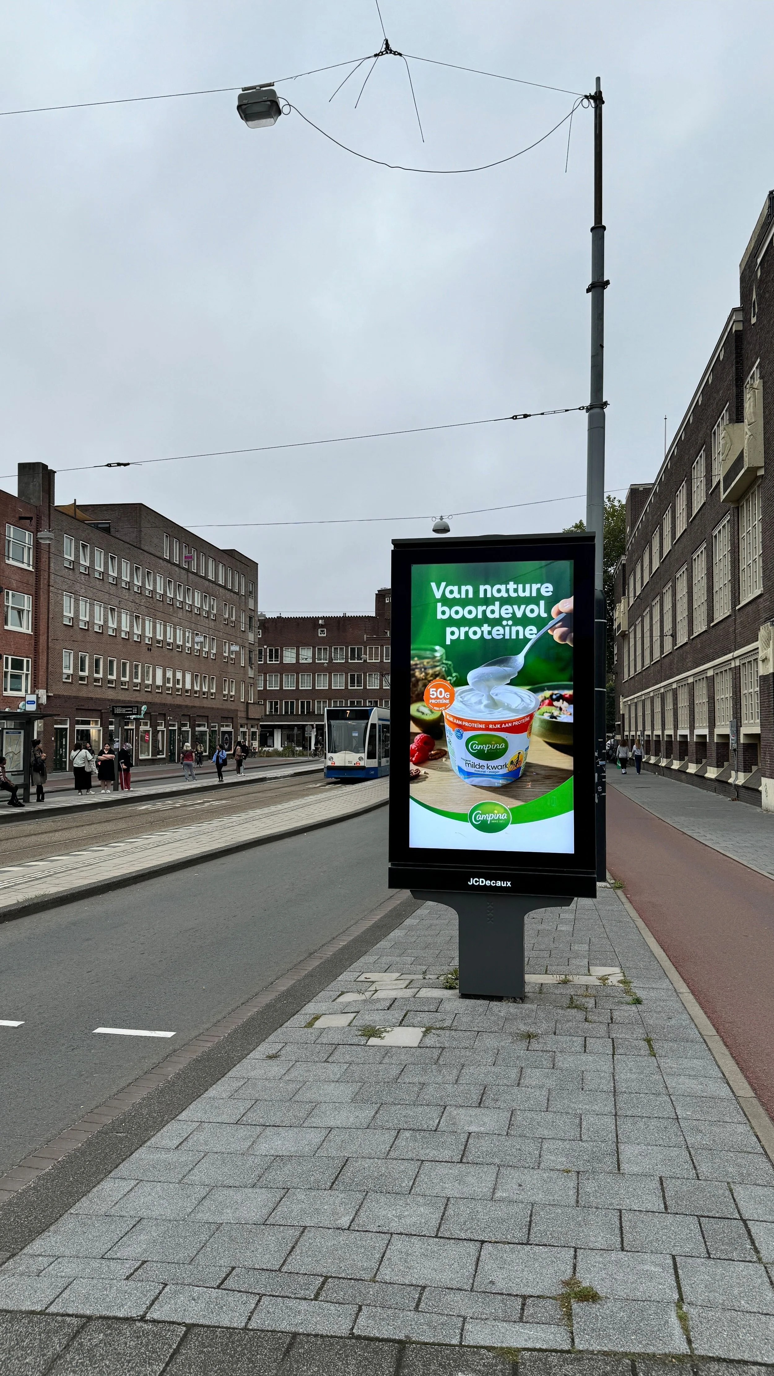
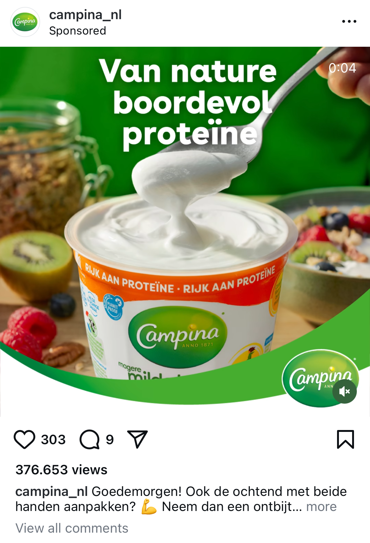
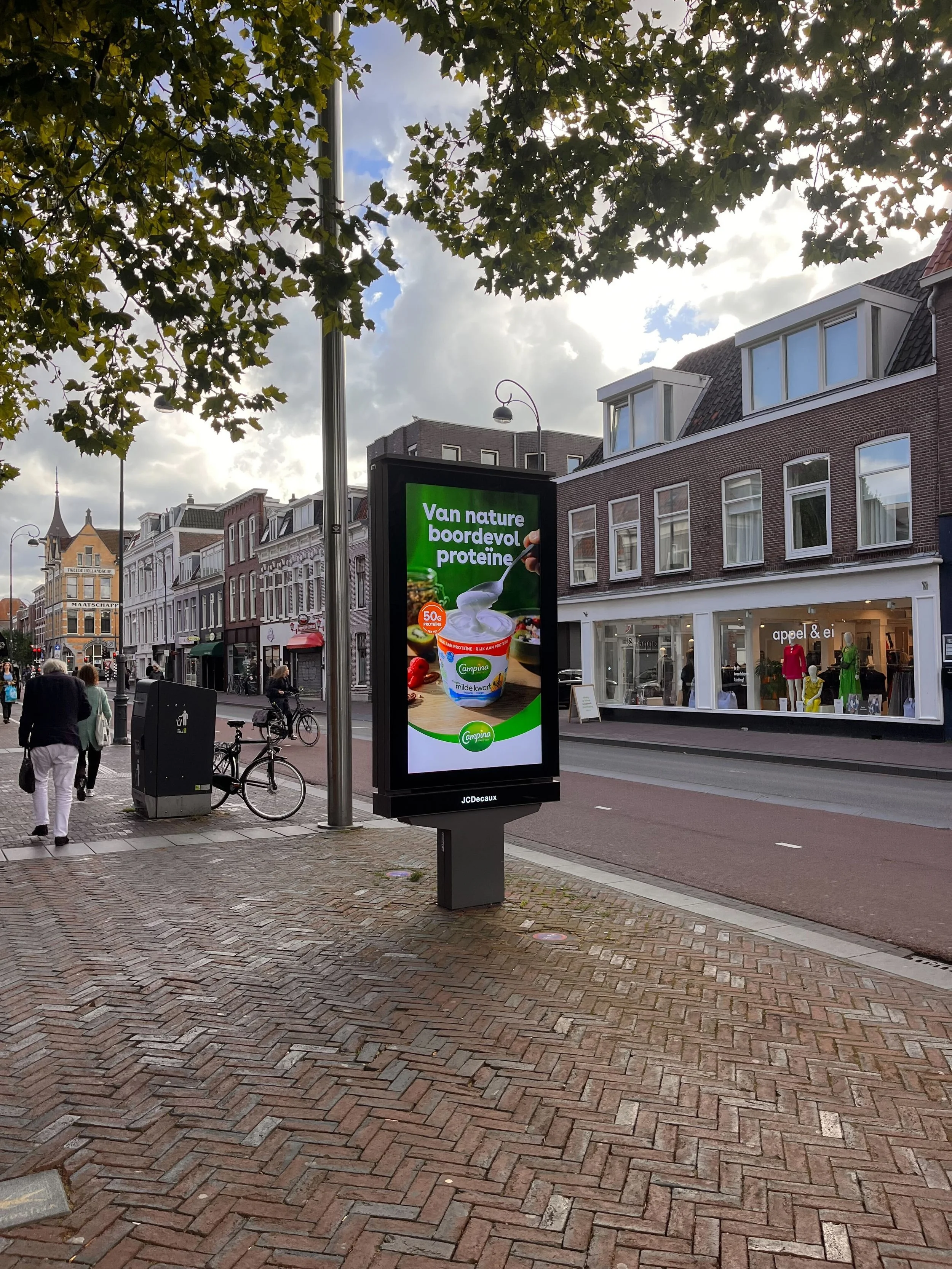
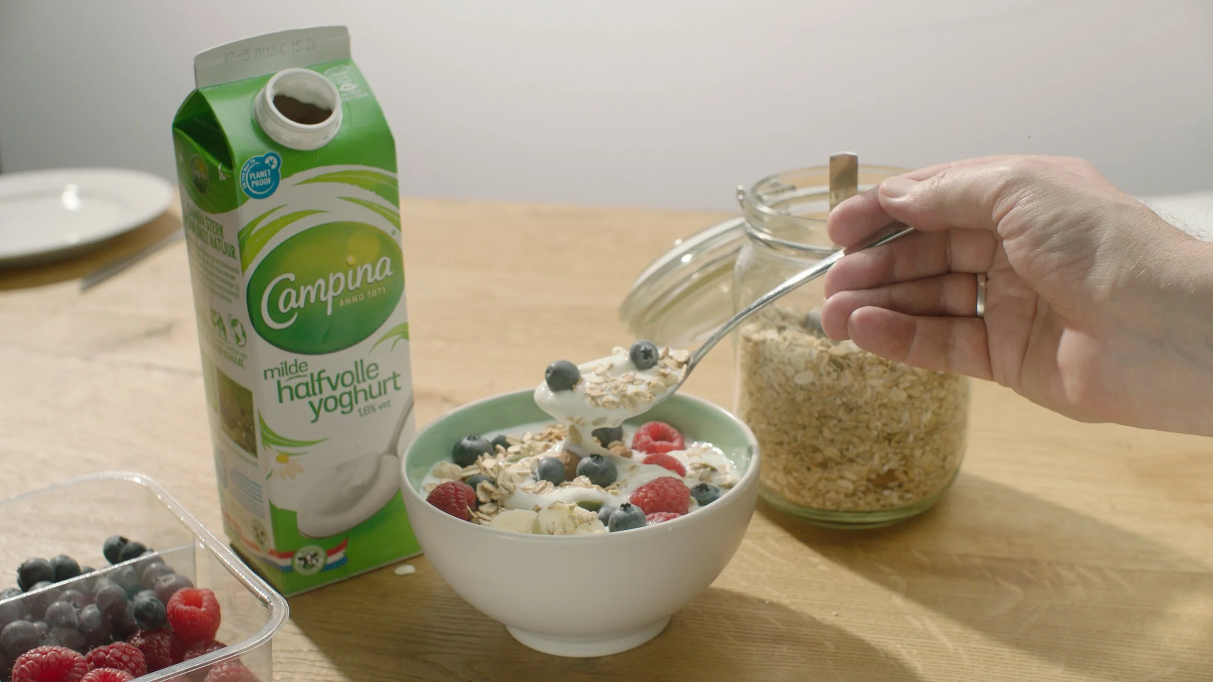
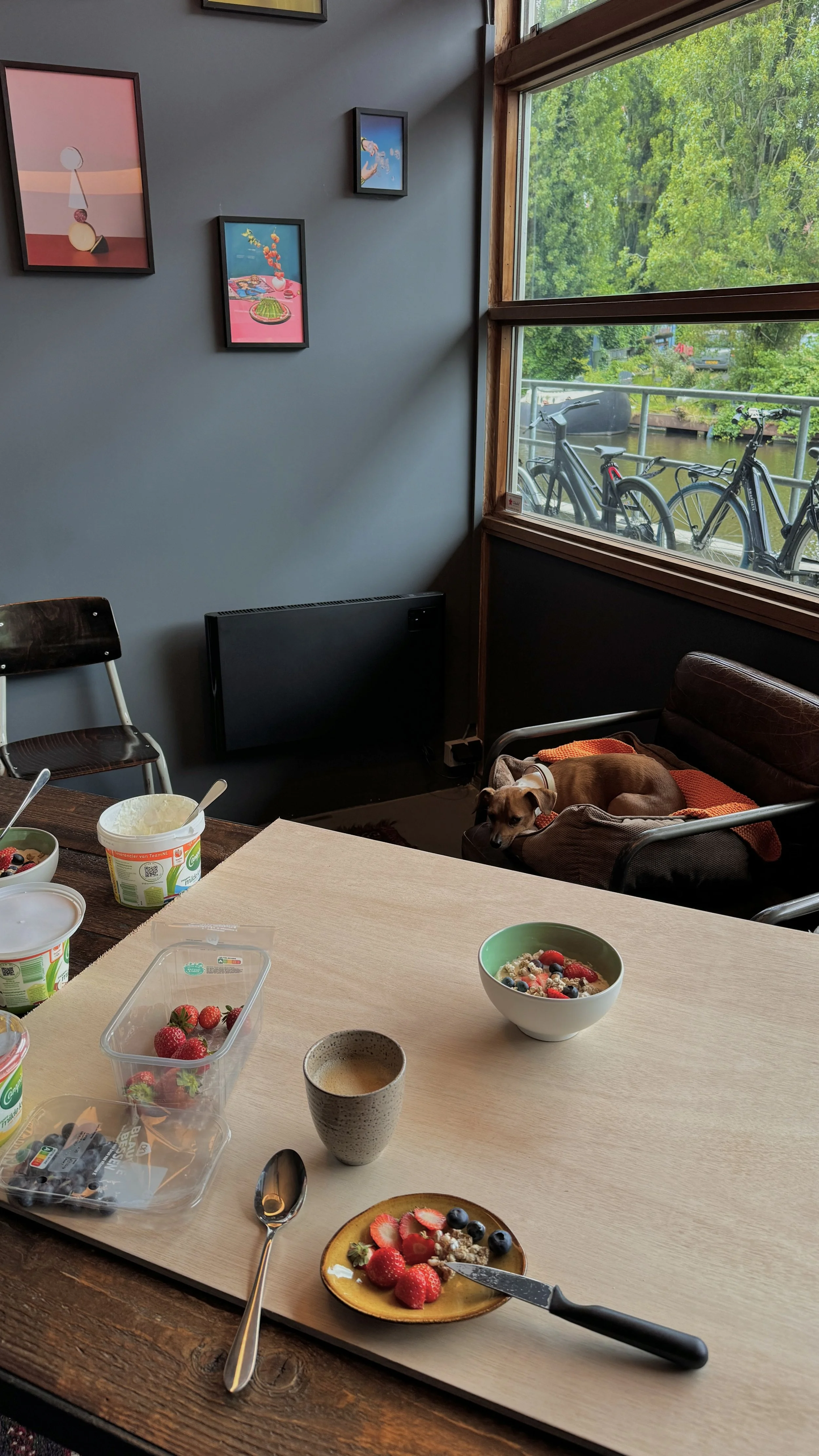
The project culminated in a distinct culinary identity, a little lipje in the product, for Campina’s quark product specifically. This identity was rolled out in a new campaign featuring both stills and TVCs, ensuring a cohesive and appetizing representation of the brand.
To support future consistency, we delivered a comprehensive playbook detailing the visual codes and guidelines for applying and recreating the culinary identity across assets. Campina has since continued to build on this foundation, collaborating with Chuck Studios to expand the identity to other products in their lineup.